


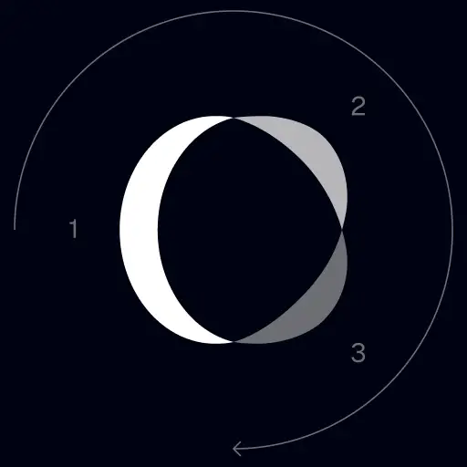
TrackingMore أصول العلامة التجارية
شكرا لاهتمامك ب TrackingMore. للحفاظ على سلامة العلامة التجارية ، حددنا بعض الإرشادات الأساسية للاستخدام الصحيح لأصول علامتنا التجارية. سنكون ممتنين إذا كان بإمكانك قضاء بعض الوقت في الاطلاع على هذه المعايير والالتزام بها.
اسم العلامة التجارية
“TrackingMore” combines “Tracking” and “More.” Both words should have an uppercase letter at the beginning.

محرف
We use the IBM Plex Sans typeface family to pay tribute to IBM’s brand spirit of innovation. We try to leave users the same impression when they interact with our tracking system.
Primary Logo
The TrackingMore primary logo is available in three versions to ensure clear and consistent visibility across different backgrounds. Choose the version that provides the best contrast for your application.

الشعار الأساسي
هذا هو شعار TrackingMore الرئيسي. يجب استخدامه في هذا النموذج كلما أمكن ذلك.

الشعار الأساسي المقلوب
يتميز هذا الإصدار بعلامة نفتية بيضاء لمزيد من الوضوح على الخلفيات الداكنة أو المزدحمة.

الشعار الرئيسي المتكيف
استخدم هذا الإصدار على الخلفيات ذات الألوان الصلبة للحفاظ على وضوح الشعار واتساق ظهوره.
Icon Logo
Our icon can stand alone as an app icon, favicon or avatar. Keep generous clear space around it and never recolor the individual arcs.



Black & White Logo Options
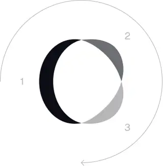
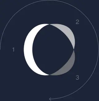
These are the primary logo appearances for black and white applications.The symbol uses a directional color progression that adapts to background contrast. On a light background, the tones within the symbol run from darker to lighter, clockwise. On a dark background the clockwise direction stays the same, but the progression flips from lighter to darker, preserving clarity and visual balance.
Brand Colors
The refreshed brand is built on a neutral, monochrome palette drawn from the new logo. Color is used sparingly to keep the mark the hero.
Minimum size
يجب ألا يقل عرض شعارنا عن 96 بكسل في التنسيق الرقمي و 26 مم في تنسيق الطباعة.
رقمي
96 بكسل (العرض)

طبع
26 مم (العرض)
أفضل الممارسات
A few things to avoid so the logo always shows up at its best.


 لا تستخدم الشعار القديم.
 لا تستخدم العلامة النصية وحدها.
 لا تقم بتدوير الشعار.
 لا تشوه الشعار.
 لا تعكس ترتيب العلامة النصية والرمز.
 لا تجعل الشعار ضبابيا.
 لا تستخدم خلفية ذات تباين غير كاف.
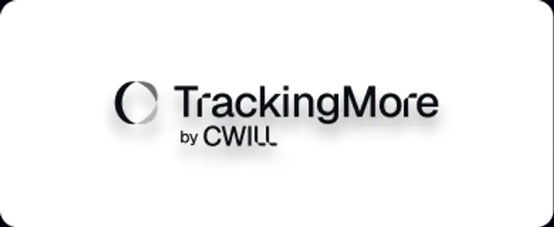 لا تستخدم التدرجات أو الظلال.
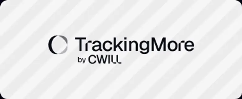 لا تستخدم الخلفيات المشغولة.

Transform Your Shipment Tracking Today
Discover how TrackingMore can help to further simplify dropshipping and improve customer satisfaction.