


TrackingMore Marken-Assets
Vielen Dank, dass Sie sich für TrackingMore interessieren. Um die Markenintegrität zu wahren, haben wir einige wesentliche Richtlinien für die korrekte Verwendung unserer Marken-Assets zusammengestellt. Wir würden uns freuen, wenn Sie sich einen Moment Zeit nehmen könnten, um diese Standards durchzugehen und einzuhalten.
Markenname
“TrackingMore” combines “Tracking” and “More.” Both words should have an uppercase letter at the beginning.

Schrift
We use the IBM Plex Sans typeface family to pay tribute to IBM’s brand spirit of innovation. We try to leave users the same impression when they interact with our tracking system.
Primary Logo
The TrackingMore primary logo is available in three versions to ensure clear and consistent visibility across different backgrounds. Choose the version that provides the best contrast for your application.
Primäres Logo
Dies ist das Hauptlogo von TrackingMore. Es sollte in dieser Form verwendet werden, wann immer dies möglich ist.

Invertiertes primäres Logo
Diese Version verfügt über eine weiße Wortmarke für eine bessere Lesbarkeit auf dunklen oder belebten Hintergründen.

Adaptives Primärlogo
Verwenden Sie diese Version auf einfarbigen Hintergründen, um eine klare und konsistente Sichtbarkeit des Logos zu gewährleisten.
Icon Logo
Our icon can stand alone as an app icon, favicon or avatar. Keep generous clear space around it and never recolor the individual arcs.



Black & White Logo Options
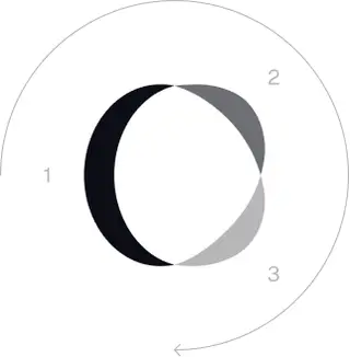
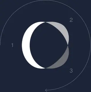
These are the primary logo appearances for black and white applications.The symbol uses a directional color progression that adapts to background contrast. On a light background, the tones within the symbol run from darker to lighter, clockwise. On a dark background the clockwise direction stays the same, but the progression flips from lighter to darker, preserving clarity and visual balance.
Brand Colors
The refreshed brand is built on a neutral, monochrome palette drawn from the new logo. Color is used sparingly to keep the mark the hero.
Minimum size
Die Breite unseres Logos sollte niemals weniger als 96 Pixel im digitalen Format und 26 mm im Druckformat betragen.
Digital
96px (Breite)

26mm (Breite)
Bewährte Methoden
A few things to avoid so the logo always shows up at its best.


 Verwenden Sie nicht das alte Logo.
 Verwenden Sie die Wortmarke nicht allein.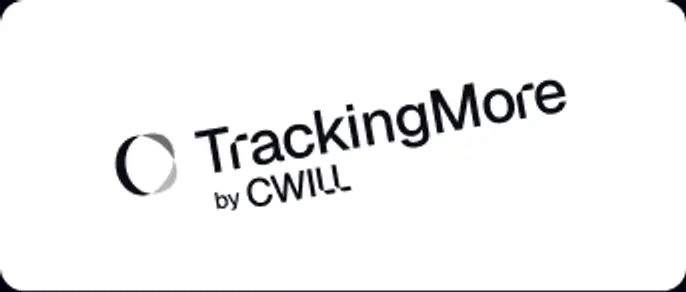
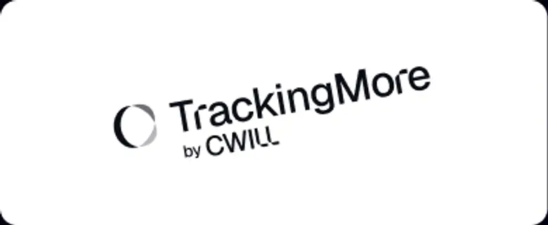 Drehen Sie das Logo nicht.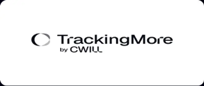
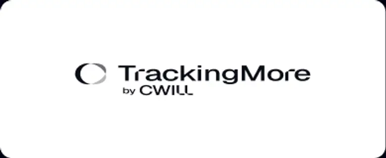 Verzerren Sie das Logo nicht.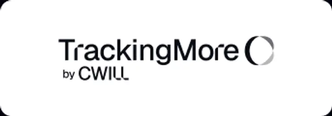
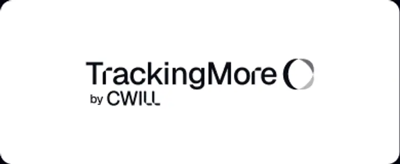 Vertauschen Sie nicht die Reihenfolge der Wortmarke und des Symbols.
 Machen Sie das Logo nicht verschwommen.
 Verwenden Sie keinen Hintergrund mit unzureichendem Kontrast.
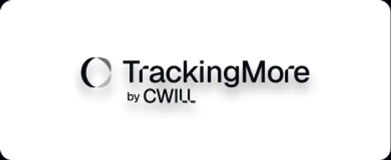 Verwenden Sie keine Farbverläufe oder Schatten.
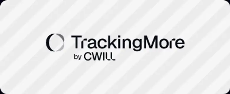 Verwenden Sie keine unruhigen Hintergründe.

Transform Your Shipment Tracking Today
Discover how TrackingMore can help to further simplify dropshipping and improve customer satisfaction.