


TrackingMore Activos de marca
Gracias por interesarse en TrackingMore. Para mantener la integridad de la marca, hemos esbozado algunas pautas esenciales para utilizar correctamente nuestros activos de marca. Le agradeceríamos que se tomara un momento para revisar estos estándares y cumplirlos.
Marca
“TrackingMore” combines “Tracking” and “More.” Both words should have an uppercase letter at the beginning.

Tipo de letra
We use the IBM Plex Sans typeface family to pay tribute to IBM’s brand spirit of innovation. We try to leave users the same impression when they interact with our tracking system.
Primary Logo
The TrackingMore primary logo is available in three versions to ensure clear and consistent visibility across different backgrounds. Choose the version that provides the best contrast for your application.
Logotipo principal
Este es el logotipo principal de TrackingMore. Debe usarse en esta forma siempre que sea posible.

Logotipo principal invertido
Esta versión cuenta con una marca denominativa blanca para una mayor legibilidad en fondos oscuros o recargados.

Logotipo principal adaptativo
Utiliza esta versión sobre fondos de colores sólidos para mantener una visibilidad clara y uniforme del logotipo.
Icon Logo
Our icon can stand alone as an app icon, favicon or avatar. Keep generous clear space around it and never recolor the individual arcs.



Black & White Logo Options
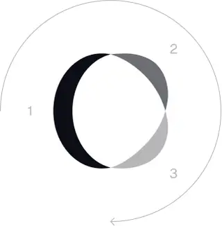
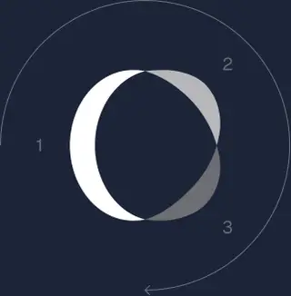
These are the primary logo appearances for black and white applications.The symbol uses a directional color progression that adapts to background contrast. On a light background, the tones within the symbol run from darker to lighter, clockwise. On a dark background the clockwise direction stays the same, but the progression flips from lighter to darker, preserving clarity and visual balance.
Brand Colors
The refreshed brand is built on a neutral, monochrome palette drawn from the new logo. Color is used sparingly to keep the mark the hero.
Minimum size
El ancho de nuestro logotipo nunca debe ser inferior a 96px en formato digital y 26mm en formato impreso.
Digital
96px (ancho)

Impresión
26mm (ancho)
Prácticas recomendadas
A few things to avoid so the logo always shows up at its best.


 No utilices el logotipo anterior.
 No uses solo la marca denominativa.
 No gires el logotipo.
 No distorsiones el logotipo.
 No inviertas el orden de la marca denominativa y el icono.
 No hagas que el logotipo se vea borroso.
 No utilices un fondo con un contraste insuficiente.
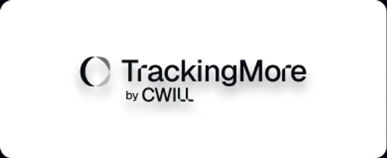 No utilices degradados ni sombras.
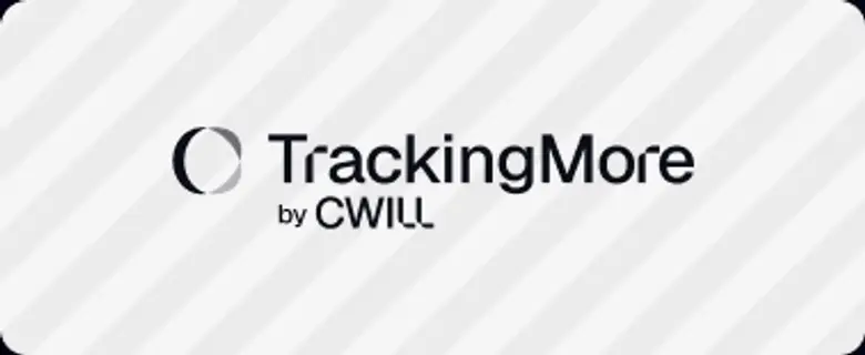 No utilices fondos recargados.

Transform Your Shipment Tracking Today
Discover how TrackingMore can help to further simplify dropshipping and improve customer satisfaction.