


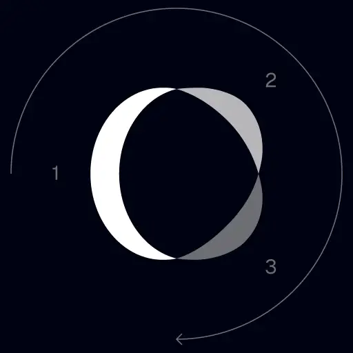
TrackingMore Actifs de marque
Merci de vous intéresser à TrackingMore. Pour préserver l’intégrité de la marque, nous avons défini quelques directives essentielles pour utiliser correctement nos ressources de marque. Nous vous serions reconnaissants de bien vouloir prendre un moment pour passer en revue ces normes et les respecter.
Marque
“TrackingMore” combines “Tracking” and “More.” Both words should have an uppercase letter at the beginning.

Fonte de caractères
We use the IBM Plex Sans typeface family to pay tribute to IBM’s brand spirit of innovation. We try to leave users the same impression when they interact with our tracking system.
Primary Logo
The TrackingMore primary logo is available in three versions to ensure clear and consistent visibility across different backgrounds. Choose the version that provides the best contrast for your application.
Logo principal
Il s’agit du logo principal de TrackingMore. Il doit être utilisé sous cette forme dans la mesure du possible.

Logo principal inversé
Cette version comporte un mot-symbole blanc pour une meilleure lisibilité sur les arrière-plans sombres ou occupés.

Logo principal adaptatif
Utilisez cette version sur des arrière-plans unis afin de garantir une visibilité claire et cohérente du logo.
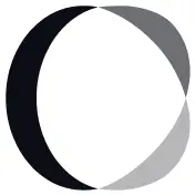
Icon Logo
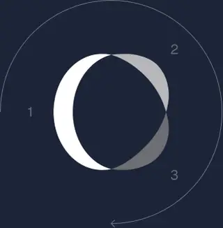
Our icon can stand alone as an app icon, favicon or avatar. Keep generous clear space around it and never recolor the individual arcs.


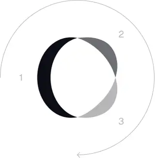
Black & White Logo Options
These are the primary logo appearances for black and white applications.The symbol uses a directional color progression that adapts to background contrast. On a light background, the tones within the symbol run from darker to lighter, clockwise. On a dark background the clockwise direction stays the same, but the progression flips from lighter to darker, preserving clarity and visual balance.
Brand Colors
The refreshed brand is built on a neutral, monochrome palette drawn from the new logo. Color is used sparingly to keep the mark the hero.
Minimum size
La largeur de notre logo ne doit jamais descendre en dessous de 96 pixels au format numérique et de 26 mm au format imprimé.
Numérique
96px (largeur)

Imprimer
26 mm (largeur)
Bonnes pratiques
A few things to avoid so the logo always shows up at its best.
 N’utilisez pas l’ancien logo.
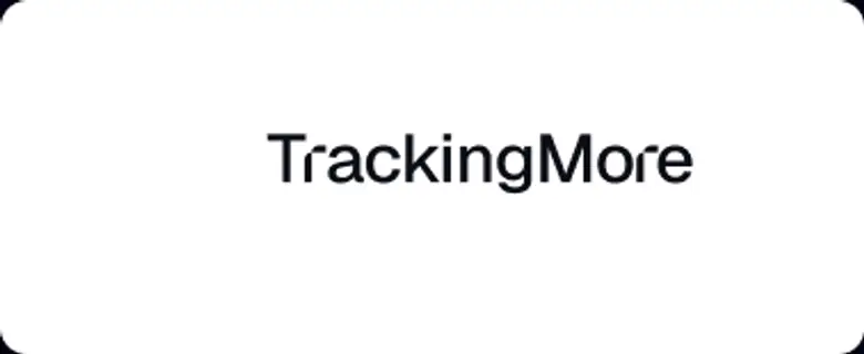 N’utilisez pas le mot-symbole seul.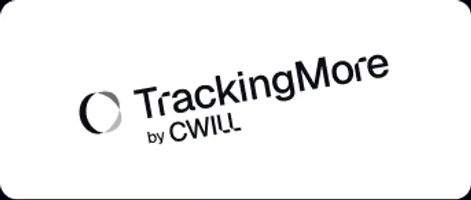
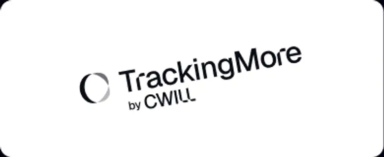 Ne faites pas pivoter le logo.
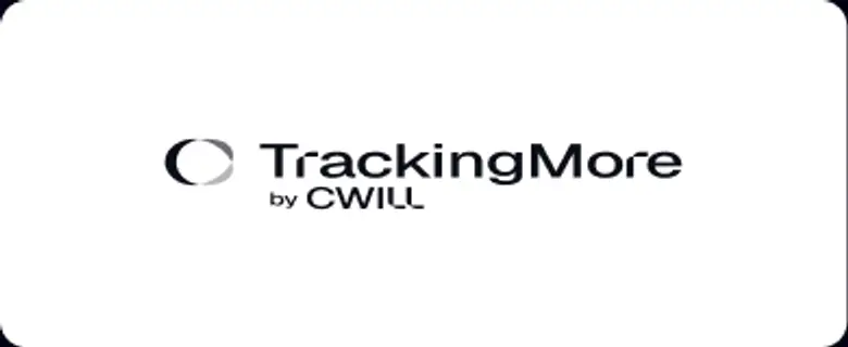 Ne déformez pas le logo.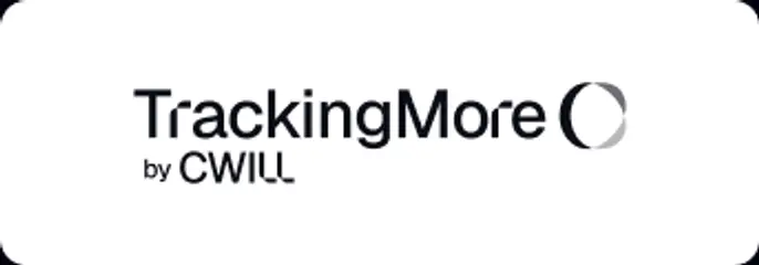
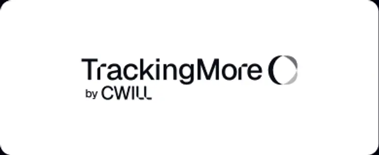 N’inversez pas l’ordre du mot-symbole et de l’icône.
 Ne rendez pas le logo flou.
 N’utilisez pas un arrière-plan avec un contraste insuffisant.
 N’utilisez pas de dégradés ou d’ombres.
 N’utilisez pas d’arrière-plans occupés.
Transform Your Shipment Tracking Today
Discover how TrackingMore can help to further simplify dropshipping and improve customer satisfaction.