


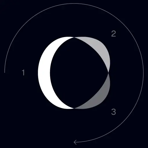
TrackingMore Aset Merek
Terima kasih telah tertarik dengan TrackingMore. Untuk menjaga integritas merek, kami telah menguraikan beberapa pedoman penting untuk menggunakan aset merek kami dengan benar. Kami akan sangat menghargai jika Anda dapat meluangkan waktu sejenak untuk membahas standar ini dan mematuhinya.
Nama merek
“TrackingMore” combines “Tracking” and “More.” Both words should have an uppercase letter at the beginning.

Tipografi
We use the IBM Plex Sans typeface family to pay tribute to IBM’s brand spirit of innovation. We try to leave users the same impression when they interact with our tracking system.
Primary Logo
The TrackingMore primary logo is available in three versions to ensure clear and consistent visibility across different backgrounds. Choose the version that provides the best contrast for your application.
Logo utama
Ini adalah logo utama TrackingMore. Ini harus digunakan dalam bentuk ini bila memungkinkan.
Logo utama terbalik
Versi ini menampilkan tanda kata putih untuk keterbacaan yang lebih besar pada latar belakang gelap atau sibuk.
Logo utama adaptif
Gunakan versi ini pada latar belakang berwarna solid untuk menjaga visibilitas logo tetap jelas dan konsisten.
Icon Logo
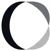
Our icon can stand alone as an app icon, favicon or avatar. Keep generous clear space around it and never recolor the individual arcs.


Black & White Logo Options
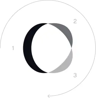
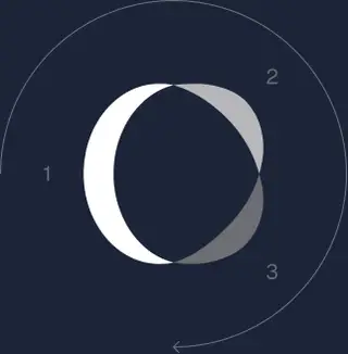
These are the primary logo appearances for black and white applications.The symbol uses a directional color progression that adapts to background contrast. On a light background, the tones within the symbol run from darker to lighter, clockwise. On a dark background the clockwise direction stays the same, but the progression flips from lighter to darker, preserving clarity and visual balance.
Brand Colors
The refreshed brand is built on a neutral, monochrome palette drawn from the new logo. Color is used sparingly to keep the mark the hero.
Minimum size
Lebar logo kita tidak boleh lebih rendah dari 96px dalam format digital dan 26mm dalam format cetak.
Digital
96px (lebar)

Mencetak
26mm (lebar)
Praktik Terbaik
A few things to avoid so the logo always shows up at its best.
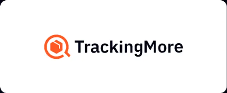
 Jangan gunakan logo lama.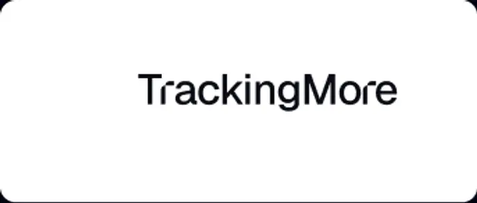
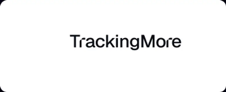 Jangan gunakan tanda kata saja.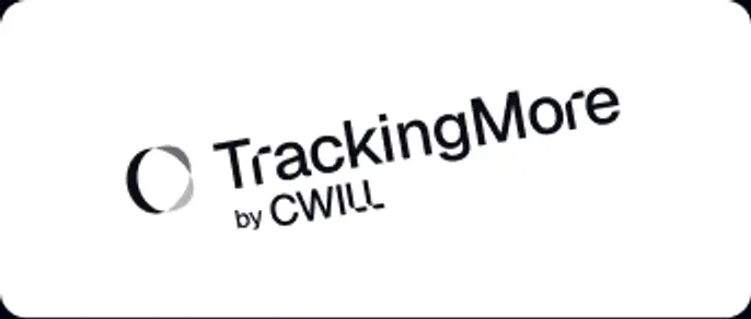
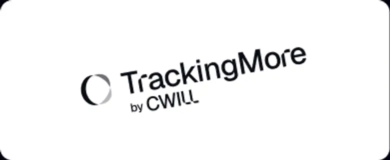 Jangan memutar logo.
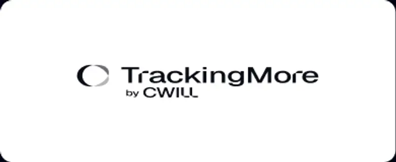 Jangan mendistorsi logo.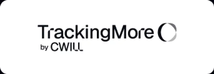
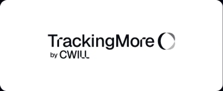 Jangan membalikkan urutan tanda kata dan ikon.
 Jangan membuat logo buram.
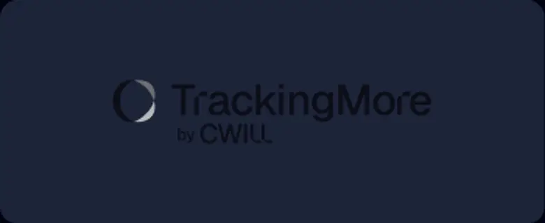 Jangan gunakan latar belakang dengan kontras yang tidak memadai.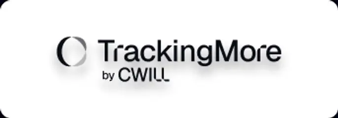
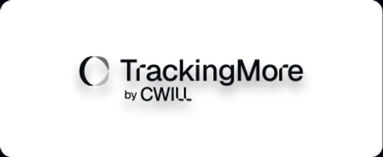 Jangan gunakan gradien atau bayangan.
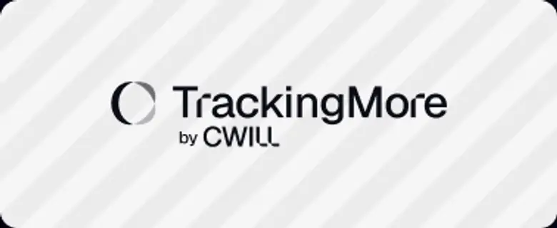 yang sibuk.

Transform Your Shipment Tracking Today
Discover how TrackingMore can help to further simplify dropshipping and improve customer satisfaction.