


TrackingMore Risorse del marchio
Grazie per esserti interessato a TrackingMore. Per mantenere l'integrità del marchio, abbiamo delineato alcune linee guida essenziali per il corretto utilizzo delle risorse del nostro marchio. Ti saremmo grati se potessi prenderti un momento per esaminare questi standard e rispettarli.
Marca
“TrackingMore” combines “Tracking” and “More.” Both words should have an uppercase letter at the beginning.

Carattere tipografico
We use the IBM Plex Sans typeface family to pay tribute to IBM’s brand spirit of innovation. We try to leave users the same impression when they interact with our tracking system.
Primary Logo
The TrackingMore primary logo is available in three versions to ensure clear and consistent visibility across different backgrounds. Choose the version that provides the best contrast for your application.

Logo principale
Questo è il logo principale di TrackingMore. Dovrebbe essere utilizzato in questa forma ogni volta che è possibile.

Logo principale invertito
Questa versione presenta una scritta bianca per una maggiore leggibilità su sfondi scuri o affollati.

Logo principale adattivo
Utilizza questa versione su sfondi a tinta unita per mantenere una visibilità chiara e coerente del logo.
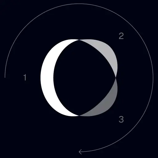
Icon Logo
Our icon can stand alone as an app icon, favicon or avatar. Keep generous clear space around it and never recolor the individual arcs.



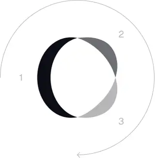
Black & White Logo Options
These are the primary logo appearances for black and white applications.The symbol uses a directional color progression that adapts to background contrast. On a light background, the tones within the symbol run from darker to lighter, clockwise. On a dark background the clockwise direction stays the same, but the progression flips from lighter to darker, preserving clarity and visual balance.

Brand Colors
The refreshed brand is built on a neutral, monochrome palette drawn from the new logo. Color is used sparingly to keep the mark the hero.
Minimum size
La larghezza del nostro logo non deve mai scendere sotto i 96px in formato digitale e i 26mm in formato stampato.
Digitale
96px (larghezza)

Stampare
26 mm (larghezza)
Migliori pratiche
A few things to avoid so the logo always shows up at its best.


 Non utilizzare il vecchio logo.
 Non utilizzare solo il marchio denominativo.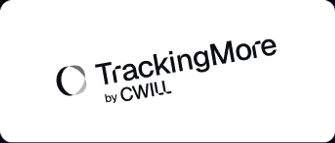
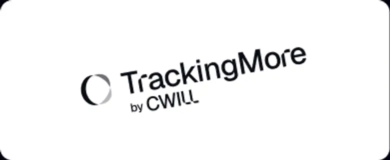 Non ruotare il logo.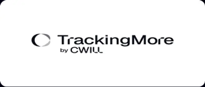
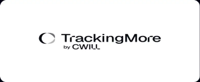 Non distorcere il logo.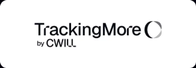
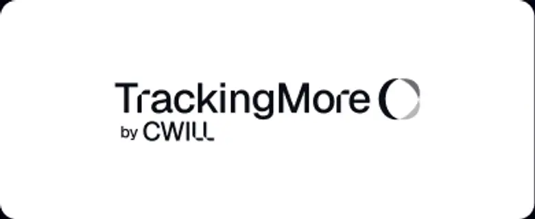 l'ordine del marchio denominativo e dell'icona.
 Non rendere il logo sfocato.
 Non utilizzare uno sfondo con contrasto insufficiente.
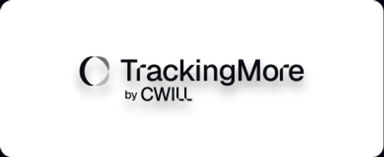 Non utilizzare sfumature o ombre.
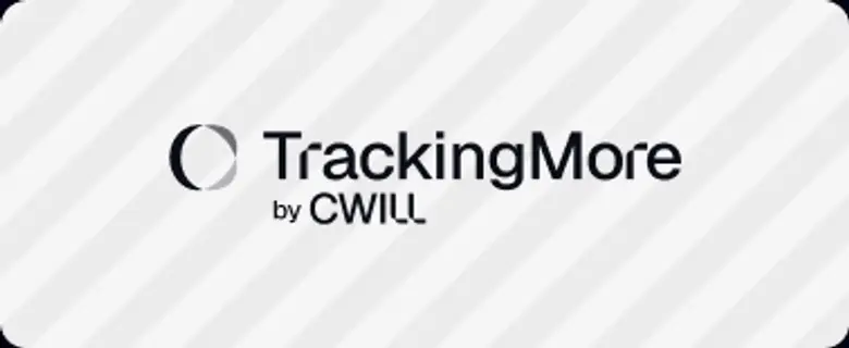 Non utilizzare sfondi affollati.

Transform Your Shipment Tracking Today
Discover how TrackingMore can help to further simplify dropshipping and improve customer satisfaction.