

TrackingMoreのブランド資産
TrackingMoreに関心をお寄せいただき、誠にありがとうございます。ブランドの完全性を維持するために、ブランド資産を正しく使用するためのいくつかの重要なガイドラインを概説しました。少し時間を取って、これらの基準をご確認いただき、遵守していただけると幸いです。
商標名
“TrackingMore” combines “Tracking” and “More.” Both words should have an uppercase letter at the beginning.

書体
We use the IBM Plex Sans typeface family to pay tribute to IBM’s brand spirit of innovation. We try to leave users the same impression when they interact with our tracking system.
Primary Logo
The TrackingMore primary logo is available in three versions to ensure clear and consistent visibility across different backgrounds. Choose the version that provides the best contrast for your application.

プライマリロゴ
これはTrackingMoreのメインロゴです。可能な限り、この形式で使用する必要があります。

反転したメイン ロゴ
このバージョンは、暗い背景や忙しい背景で読みやすくするために、白いワードマークを備えています。

適応型プライマリロゴ
ロゴの視認性を明確かつ一貫して保つため、単色の背景ではこのバージョンを使用してください。
Icon Logo
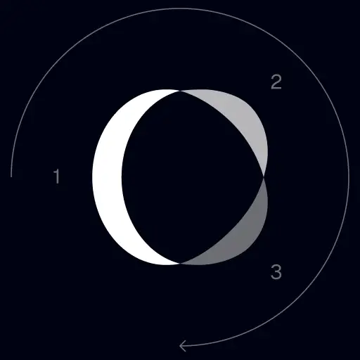
Our icon can stand alone as an app icon, favicon or avatar. Keep generous clear space around it and never recolor the individual arcs.



Black & White Logo Options
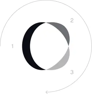
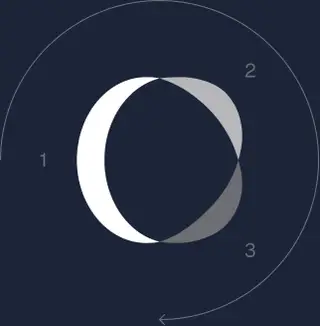
These are the primary logo appearances for black and white applications.The symbol uses a directional color progression that adapts to background contrast. On a light background, the tones within the symbol run from darker to lighter, clockwise. On a dark background the clockwise direction stays the same, but the progression flips from lighter to darker, preserving clarity and visual balance.
Brand Colors
The refreshed brand is built on a neutral, monochrome palette drawn from the new logo. Color is used sparingly to keep the mark the hero.
Minimum size
ロゴの幅は、デジタル形式で96px、印刷形式で26mmを下回ってはいけません。
デジタル
96px (幅)

プリント
26mm(幅)
ベストプラクティス
A few things to avoid so the logo always shows up at its best.


 しないでください。
 しないでください。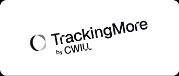
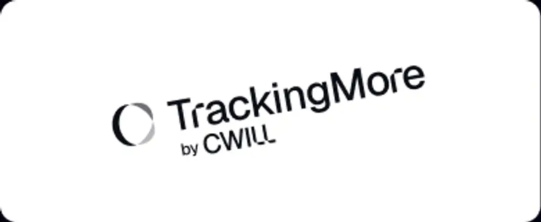 させないでください。
 めないでください。
 しないでください。
 し込まないでください。
 しないでください。
 しないでください。
 しないでください。