

TrackingMore 브랜드 자산
TrackingMore에 관심을 가져 주셔서 감사합니다. 브랜드 무결성을 유지하기 위해 브랜드 자산을 올바르게 사용하기 위한 몇 가지 필수 지침을 간략하게 설명했습니다. 잠시 시간을 내어 이러한 표준을 살펴보고 준수해 주시면 감사하겠습니다.
브랜드 이름
“TrackingMore” combines “Tracking” and “More.” Both words should have an uppercase letter at the beginning.

서체
We use the IBM Plex Sans typeface family to pay tribute to IBM’s brand spirit of innovation. We try to leave users the same impression when they interact with our tracking system.
Primary Logo
The TrackingMore primary logo is available in three versions to ensure clear and consistent visibility across different backgrounds. Choose the version that provides the best contrast for your application.

기본 로고
이것은 주요 TrackingMore 로고입니다. 가능하면 이 형식으로 사용해야 합니다.

반전된 기본 로고
이 버전은 어둡거나 바쁜 배경에서 가독성을 높이기 위해 흰색 워드마크가 있습니다.

적응형 기본 로고
로고가 선명하고 일관되게 보이도록 단색 배경에서는 이 버전을 사용하세요.
Icon Logo
Our icon can stand alone as an app icon, favicon or avatar. Keep generous clear space around it and never recolor the individual arcs.



Black & White Logo Options
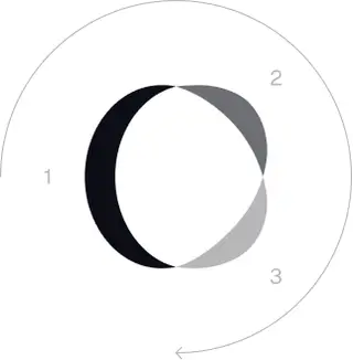
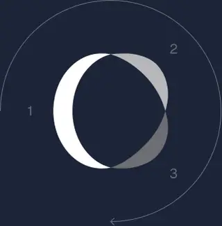
These are the primary logo appearances for black and white applications.The symbol uses a directional color progression that adapts to background contrast. On a light background, the tones within the symbol run from darker to lighter, clockwise. On a dark background the clockwise direction stays the same, but the progression flips from lighter to darker, preserving clarity and visual balance.
Brand Colors
The refreshed brand is built on a neutral, monochrome palette drawn from the new logo. Color is used sparingly to keep the mark the hero.
Minimum size
로고의 너비는 디지털 형식의 경우 96px, 인쇄 형식의 경우 26mm보다 낮아서는 안 됩니다.
디지털
96px(너비)

인쇄하다
26mm(폭)
권장사항
A few things to avoid so the logo always shows up at its best.


 마세요.
마세요.
 마세요.
마세요.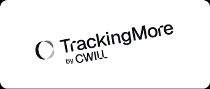
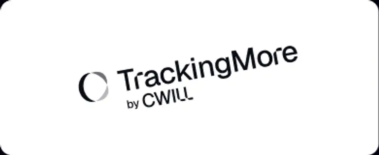 하지 마세요.
 하지 마세요.
 지 마세요.
 마세요.
마세요.
 마세요.
마세요.
 마세요.
마세요.
 마세요.
마세요.