


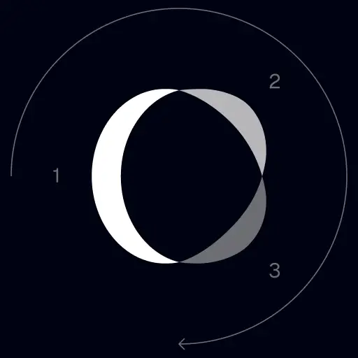
TrackingMore Merk Activa
Bedankt voor uw interesse in TrackingMore. Om de merkintegriteit te behouden, hebben we een aantal essentiële richtlijnen opgesteld voor het juiste gebruik van onze merkactiva. We zouden het op prijs stellen als u even de tijd zou willen nemen om deze normen door te nemen en u eraan te houden.
Merknaam
“TrackingMore” combines “Tracking” and “More.” Both words should have an uppercase letter at the beginning.

Lettertype
We use the IBM Plex Sans typeface family to pay tribute to IBM’s brand spirit of innovation. We try to leave users the same impression when they interact with our tracking system.
Primary Logo
The TrackingMore primary logo is available in three versions to ensure clear and consistent visibility across different backgrounds. Choose the version that provides the best contrast for your application.
Primair logo
Dit is het belangrijkste logo van TrackingMore. Het moet waar mogelijk in deze vorm worden gebruikt.
Omgekeerd primair logo
Deze versie is voorzien van een wit woordmerk voor een betere leesbaarheid op donkere of drukke achtergronden.

Adaptief primair logo
Gebruik deze versie op effen gekleurde achtergronden voor een duidelijke en consistente zichtbaarheid van het logo.
Icon Logo
Our icon can stand alone as an app icon, favicon or avatar. Keep generous clear space around it and never recolor the individual arcs.
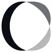


Black & White Logo Options
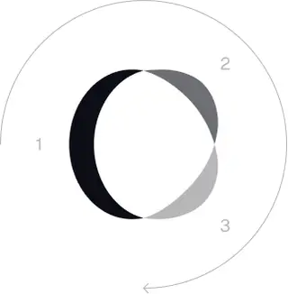
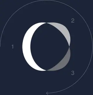
These are the primary logo appearances for black and white applications.The symbol uses a directional color progression that adapts to background contrast. On a light background, the tones within the symbol run from darker to lighter, clockwise. On a dark background the clockwise direction stays the same, but the progression flips from lighter to darker, preserving clarity and visual balance.
Brand Colors
The refreshed brand is built on a neutral, monochrome palette drawn from the new logo. Color is used sparingly to keep the mark the hero.
Minimum size
De breedte van ons logo mag nooit lager zijn dan 96px in digitaal formaat en 26 mm in printformaat.
Digitaal
96px (breedte)

Afdrukken
26mm (breedte)
Praktische tips
A few things to avoid so the logo always shows up at its best.

 Gebruik niet het oude logo.
 Gebruik niet alleen het woordmerk.
 Draai het logo niet.
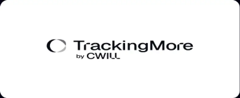 Vervorm het logo niet.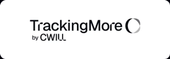
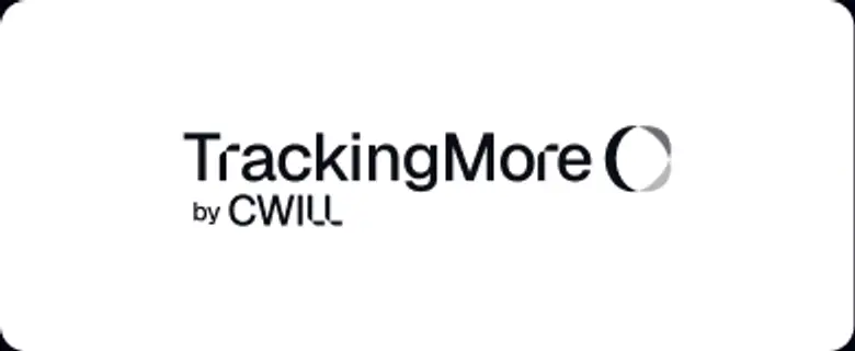 Draai de volgorde van het woordmerk en het pictogram niet om.
 Maak het logo niet wazig.
 Gebruik geen achtergrond met onvoldoende contrast.
 Gebruik geen verlopen of schaduwen.
 Gebruik geen drukke achtergronden.
Transform Your Shipment Tracking Today
Discover how TrackingMore can help to further simplify dropshipping and improve customer satisfaction.