


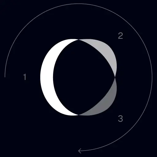
TrackingMore Zasoby marki
Dziękujemy za zainteresowanie TrackingMore. Aby zachować integralność marki, przedstawiliśmy kilka podstawowych wskazówek dotyczących prawidłowego korzystania z zasobów marki. Bylibyśmy wdzięczni, gdybyś poświęcił chwilę na zapoznanie się z tymi standardami i ich przestrzeganie.
Nazwa handlowa
“TrackingMore” combines “Tracking” and “More.” Both words should have an uppercase letter at the beginning.

Krój pisma
We use the IBM Plex Sans typeface family to pay tribute to IBM’s brand spirit of innovation. We try to leave users the same impression when they interact with our tracking system.
Primary Logo
The TrackingMore primary logo is available in three versions to ensure clear and consistent visibility across different backgrounds. Choose the version that provides the best contrast for your application.
Główne logo
To jest główne logo TrackingMore. Powinien być stosowany w tej formie, gdy tylko jest to możliwe.

Odwrócone logo główne
Ta wersja ma biały znak słowny dla większej czytelności na ciemnym lub ruchliwym tle.

Adaptacyjne logo główne
Używaj tej wersji na jednolitych tłach, aby zachować wyraźną i spójną widoczność logo.
Icon Logo
Our icon can stand alone as an app icon, favicon or avatar. Keep generous clear space around it and never recolor the individual arcs.



Black & White Logo Options
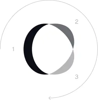
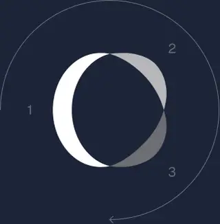
These are the primary logo appearances for black and white applications.The symbol uses a directional color progression that adapts to background contrast. On a light background, the tones within the symbol run from darker to lighter, clockwise. On a dark background the clockwise direction stays the same, but the progression flips from lighter to darker, preserving clarity and visual balance.
Brand Colors
The refreshed brand is built on a neutral, monochrome palette drawn from the new logo. Color is used sparingly to keep the mark the hero.
Minimum size
Szerokość naszego logo nigdy nie powinna być mniejsza niż 96px w formacie cyfrowym i 26mm w formacie drukowanym.
Cyfrowy
96px (szerokość)

Drukować
26mm (szerokość)
Sprawdzone metody
A few things to avoid so the logo always shows up at its best.


 Nie używaj starego logo.
 Nie używaj samego logotypu.
 Nie obracaj logo.
 Nie zniekształcaj logo.
 Nie odwracaj kolejności znaku słownego i ikony.
 Nie pozwól, aby logo było rozmyte.
 Nie używaj tła o niewystarczającym kontraście.
 Nie używaj gradientów ani cieni.
 Nie używaj zajętego tła.

Transform Your Shipment Tracking Today
Discover how TrackingMore can help to further simplify dropshipping and improve customer satisfaction.