


TrackingMore Ativos da marca
Obrigado por se interessar pelo TrackingMore. Para manter a integridade da marca, descrevemos algumas diretrizes essenciais para o uso correto de nossos ativos de marca. Agradeceríamos se você pudesse reservar um momento para examinar esses padrões e cumpri-los.
Marca
“TrackingMore” combines “Tracking” and “More.” Both words should have an uppercase letter at the beginning.

Família tipográfica
We use the IBM Plex Sans typeface family to pay tribute to IBM’s brand spirit of innovation. We try to leave users the same impression when they interact with our tracking system.
Primary Logo
The TrackingMore primary logo is available in three versions to ensure clear and consistent visibility across different backgrounds. Choose the version that provides the best contrast for your application.
Logotipo principal
Este é o logotipo principal do TrackingMore. Deve ser usado desta forma sempre que possível.

Logotipo principal invertido
Esta versão apresenta uma marca branca para maior legibilidade em fundos escuros ou ocupados.

Logótipo principal adaptativo
Utilize esta versão em fundos de cores sólidas para manter uma visibilidade clara e consistente do logótipo.
Icon Logo
Our icon can stand alone as an app icon, favicon or avatar. Keep generous clear space around it and never recolor the individual arcs.



Black & White Logo Options
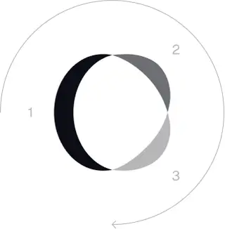
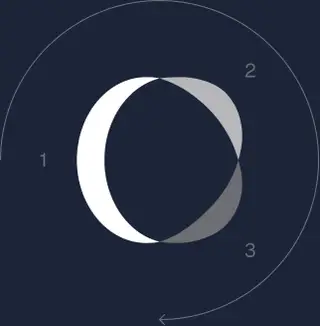
These are the primary logo appearances for black and white applications.The symbol uses a directional color progression that adapts to background contrast. On a light background, the tones within the symbol run from darker to lighter, clockwise. On a dark background the clockwise direction stays the same, but the progression flips from lighter to darker, preserving clarity and visual balance.
Brand Colors
The refreshed brand is built on a neutral, monochrome palette drawn from the new logo. Color is used sparingly to keep the mark the hero.
Minimum size
A largura do nosso logotipo nunca deve ser inferior a 96px em formato digital e 26 mm em formato impresso.
Digital
96px (largura)

Imprimir
26mm (largura)
Melhores práticas
A few things to avoid so the logo always shows up at its best.

 Não use o logotipo antigo.
 Não use apenas a marca nominativa.
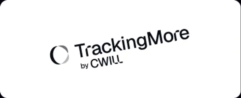 Não gire o logotipo.
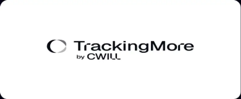 Não distorça o logotipo.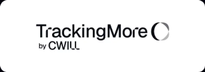
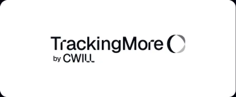 Não inverta a ordem da marca nominativa e do ícone.
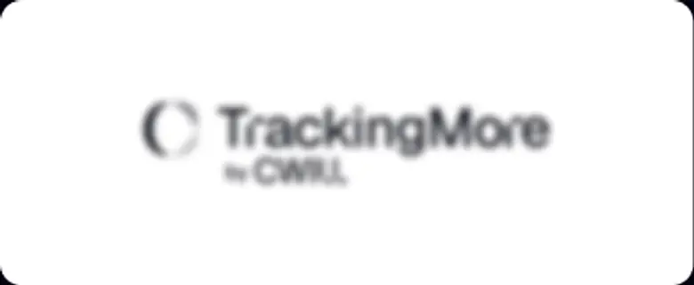 Não deixe o logotipo borrado.
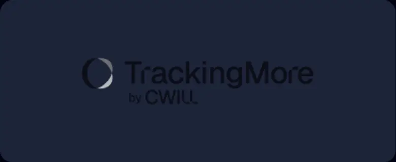 Não use um plano de fundo com contraste insuficiente.
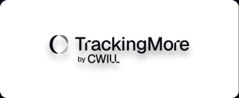 Não use gradientes ou sombras.
 Não use fundos ocupados.

Transform Your Shipment Tracking Today
Discover how TrackingMore can help to further simplify dropshipping and improve customer satisfaction.