


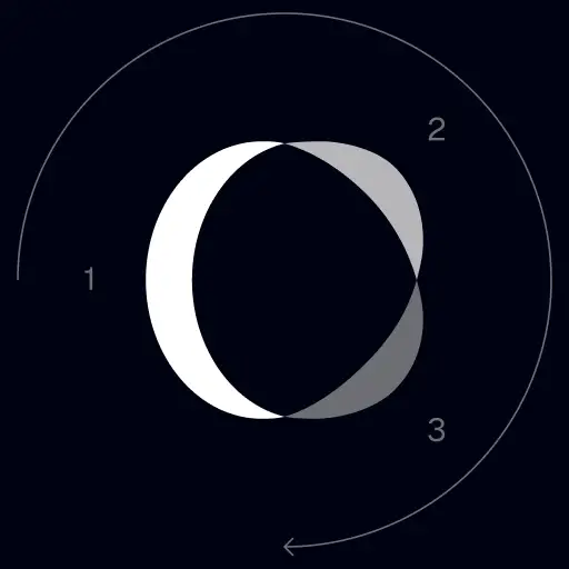
TrackingMore Varumärkestillgångar
Tack för att du intresserar dig för TrackingMore. För att upprätthålla varumärkets integritet har vi beskrivit några viktiga riktlinjer för att använda våra varumärkestillgångar på rätt sätt. Vi skulle uppskatta om du kunde ta dig tid att gå igenom dessa standarder och följa dem.
Märkesnamn
“TrackingMore” combines “Tracking” and “More.” Both words should have an uppercase letter at the beginning.

Typsnitt
We use the IBM Plex Sans typeface family to pay tribute to IBM’s brand spirit of innovation. We try to leave users the same impression when they interact with our tracking system.
Primary Logo
The TrackingMore primary logo is available in three versions to ensure clear and consistent visibility across different backgrounds. Choose the version that provides the best contrast for your application.
Primär logotyp
Detta är TrackingMore-logotypen. Den bör användas i denna form när det är möjligt.

Inverterad primär logotyp
Den här versionen har ett vitt ordmärke för bättre läsbarhet på mörka eller röriga bakgrunder.

Anpassningsbar primär logotyp
Använd den här versionen på enfärgade bakgrunder för att behålla en tydlig och konsekvent synlighet för logotypen.
Icon Logo
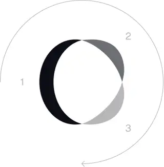
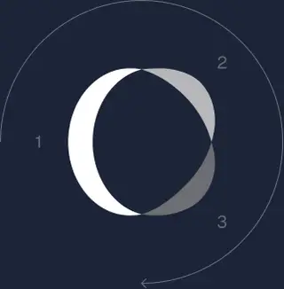
Our icon can stand alone as an app icon, favicon or avatar. Keep generous clear space around it and never recolor the individual arcs.



Black & White Logo Options
These are the primary logo appearances for black and white applications.The symbol uses a directional color progression that adapts to background contrast. On a light background, the tones within the symbol run from darker to lighter, clockwise. On a dark background the clockwise direction stays the same, but the progression flips from lighter to darker, preserving clarity and visual balance.
Brand Colors
The refreshed brand is built on a neutral, monochrome palette drawn from the new logo. Color is used sparingly to keep the mark the hero.
Minimum size
Bredden på vår logotyp bör aldrig gå lägre än 96px i digitalt format och 26 mm i tryckformat.
Digital
96px (bredd)

Trycka
26 mm (bredd)
Bästa praxis
A few things to avoid so the logo always shows up at its best.

 Använd inte den gamla logotypen.
 Använd inte bara ordmärket.
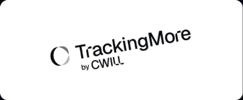 Rotera inte logotypen.
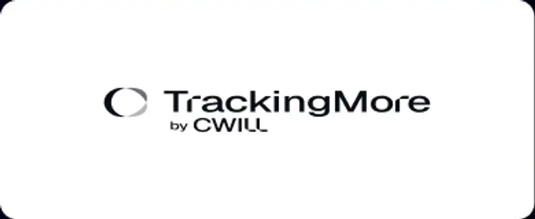 Förvräng inte logotypen.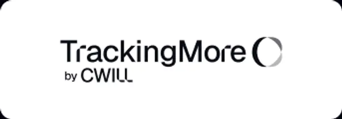
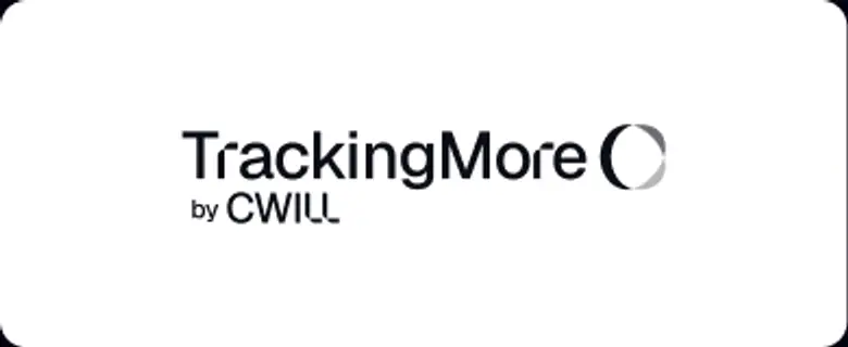 Byt inte ordning på ordmärket och ikonen.
 Gör inte logotypen suddig.
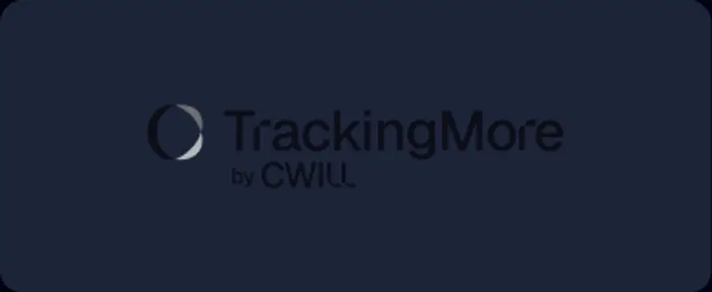 Använd inte en bakgrund med otillräcklig kontrast.
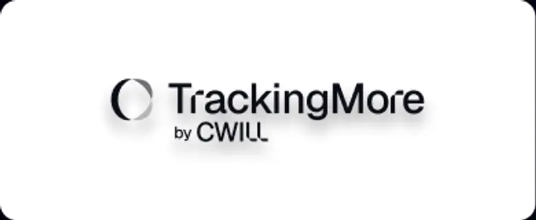 Använd inte övertoningar eller skuggor.
 Använd inte röriga bakgrunder.

Transform Your Shipment Tracking Today
Discover how TrackingMore can help to further simplify dropshipping and improve customer satisfaction.