


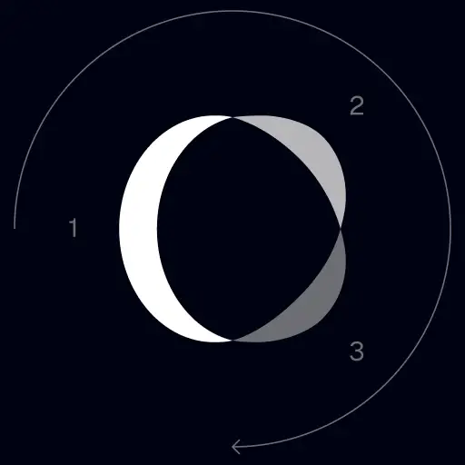
TrackingMore Marka Varlıkları
TrackingMore'a ilgi gösterdiğiniz için teşekkür ederiz. Marka bütünlüğünü korumak için, marka varlıklarımızı doğru şekilde kullanmak için birkaç temel yönergeyi özetledik. Bu standartları gözden geçirmek ve bunlara uymak için bir dakikanızı ayırabilirseniz çok memnun oluruz.
Markası
“TrackingMore” combines “Tracking” and “More.” Both words should have an uppercase letter at the beginning.

Yazı biçimi
We use the IBM Plex Sans typeface family to pay tribute to IBM’s brand spirit of innovation. We try to leave users the same impression when they interact with our tracking system.
Primary Logo
The TrackingMore primary logo is available in three versions to ensure clear and consistent visibility across different backgrounds. Choose the version that provides the best contrast for your application.
Birincil logo
Bu, ana TrackingMore logosudur. Mümkün olduğunca bu formda kullanılmalıdır.
Ters çevrilmiş birincil logo
Bu sürüm, karanlık veya yoğun arka planlarda daha fazla okunabilirlik için beyaz bir kelime işaretine sahiptir.
Uyarlanabilir ana logo
Logonun net ve tutarlı görünürlüğünü korumak için bu sürümü düz renkli arka planlarda kullanın.
Icon Logo
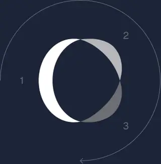
Our icon can stand alone as an app icon, favicon or avatar. Keep generous clear space around it and never recolor the individual arcs.
Black & White Logo Options
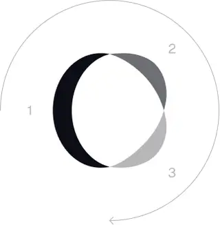
These are the primary logo appearances for black and white applications.The symbol uses a directional color progression that adapts to background contrast. On a light background, the tones within the symbol run from darker to lighter, clockwise. On a dark background the clockwise direction stays the same, but the progression flips from lighter to darker, preserving clarity and visual balance.
Brand Colors
The refreshed brand is built on a neutral, monochrome palette drawn from the new logo. Color is used sparingly to keep the mark the hero.
Minimum size
Logomuzun genişliği asla dijital formatta 96 pikselden ve baskı formatında 26 mm'den aşağı düşmemelidir.
Dijital
96 piksel (genişlik)
Yazdırmak
26 mm (genişlik)
En İyi Uygulamalar
A few things to avoid so the logo always shows up at its best.

 kullanmayın.
 Kelime işaretini tek başına kullanmayın.
 Logoyu döndürmeyin .
 Logoyu bozmayın .
 çevirmeyin.
 Logoyu bulanık yapmayın .
 Yetersiz kontrasta sahip bir arka plan kullanmayın.
 Degradeler veya gölgeler kullanmayın.
 Meşgul arka planlar kullanmayın.
Transform Your Shipment Tracking Today
Discover how TrackingMore can help to further simplify dropshipping and improve customer satisfaction.