

TrackingMore品牌資產
感謝您對 TrackingMore 的關註。為了維護品牌完整性,我們概述了一些正確使用我們品牌資產的基本準則。如果您能花點時間瀏覽這些標準並遵守它們,我們將不勝感激。
品牌名
“TrackingMore” combines “Tracking” and “More.” Both words should have an uppercase letter at the beginning.

字體
We use the IBM Plex Sans typeface family to pay tribute to IBM’s brand spirit of innovation. We try to leave users the same impression when they interact with our tracking system.
Primary Logo
The TrackingMore primary logo is available in three versions to ensure clear and consistent visibility across different backgrounds. Choose the version that provides the best contrast for your application.

主logo
這是 TrackingMore 的主logo。應盡可能以這種形式使用。

反白的主logo
此版本采用白色文字,以便在深色或繁雜的背景下更清晰易讀。

自適應主標誌
請在純色背景上使用此版本,以保持標誌清晰且一致的可見性。
Icon Logo
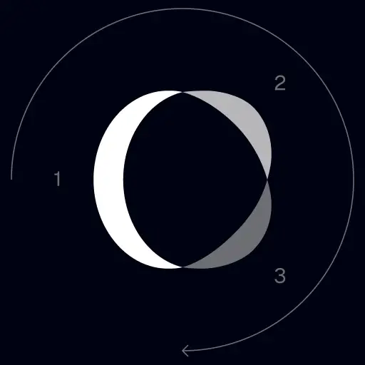
Our icon can stand alone as an app icon, favicon or avatar. Keep generous clear space around it and never recolor the individual arcs.



Black & White Logo Options
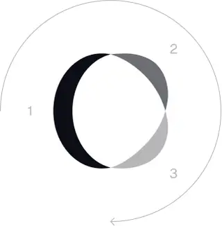
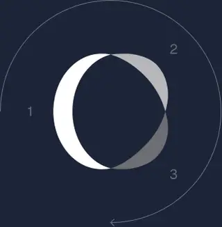
These are the primary logo appearances for black and white applications.The symbol uses a directional color progression that adapts to background contrast. On a light background, the tones within the symbol run from darker to lighter, clockwise. On a dark background the clockwise direction stays the same, but the progression flips from lighter to darker, preserving clarity and visual balance.
Brand Colors
The refreshed brand is built on a neutral, monochrome palette drawn from the new logo. Color is used sparingly to keep the mark the hero.
Minimum size
我們的logo的寬度在數字格式下不應低于96px,在打印格式下不應低于26mm。
數字格式
96px(寬)

印刷格式
26毫米(寬)
最佳實踐
A few things to avoid so the logo always shows up at its best.


 請勿使用舊logo。
 請勿單獨使用文字logo。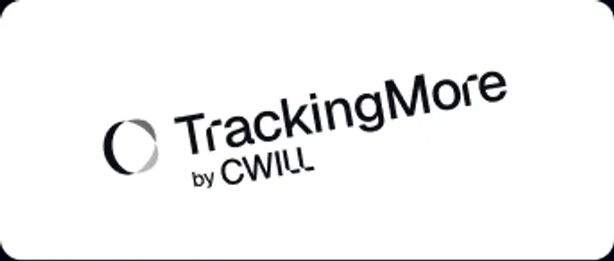
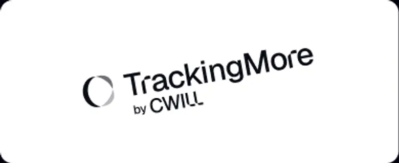 請勿旋轉logo。
 請勿扭曲logo。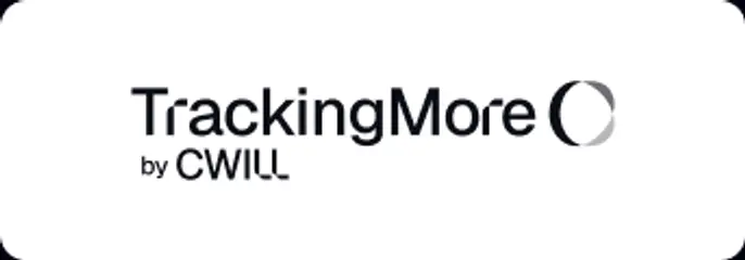
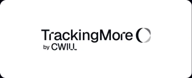 請勿顛倒品牌名和圖標的順序。
 請勿模糊logo。
 請勿使用對比度不足的背景。
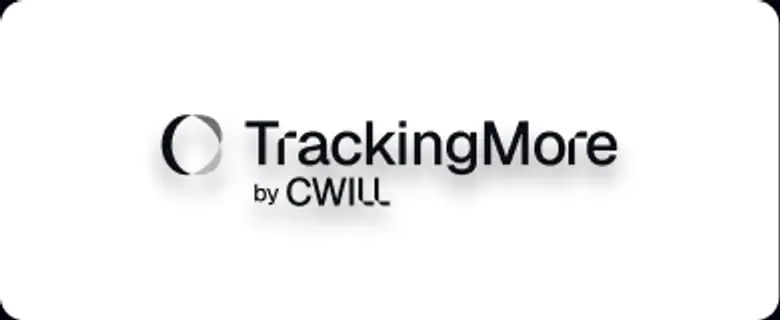 請勿使用漸變或陰影。
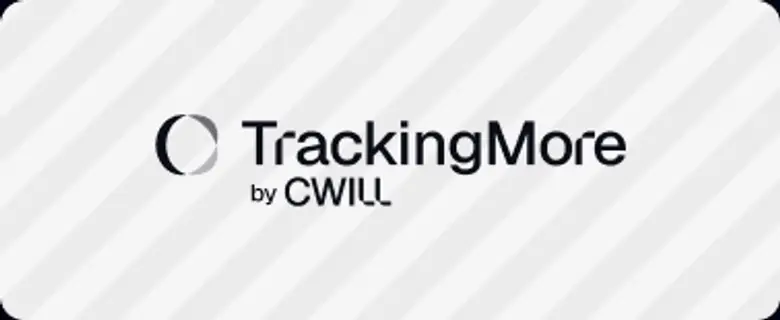 請勿使用繁雜的背景。