


TrackingMore Активы бренда
Спасибо, что проявили интерес к TrackingMore. Чтобы сохранить целостность бренда, мы изложили несколько основных рекомендаций по правильному использованию активов нашего бренда. Мы были бы признательны, если бы вы уделили время изучению этих стандартов и их соблюдению.
Фирменное наименование
“TrackingMore” combines “Tracking” and “More.” Both words should have an uppercase letter at the beginning.

Шрифт
We use the IBM Plex Sans typeface family to pay tribute to IBM’s brand spirit of innovation. We try to leave users the same impression when they interact with our tracking system.
Primary Logo
The TrackingMore primary logo is available in three versions to ensure clear and consistent visibility across different backgrounds. Choose the version that provides the best contrast for your application.

Основной логотип
Это основной логотип TrackingMore. Его следует использовать в таком виде по возможности.

Инвертированный основной логотип
Эта версия имеет белый словесный знак для лучшей разборчивости на темном или перегруженном фоне.

Адаптивный основной логотип
Используйте эту версию на однотонных фонах, чтобы логотип оставался четким и хорошо различимым.
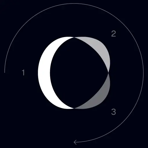
Icon Logo
Our icon can stand alone as an app icon, favicon or avatar. Keep generous clear space around it and never recolor the individual arcs.



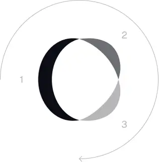
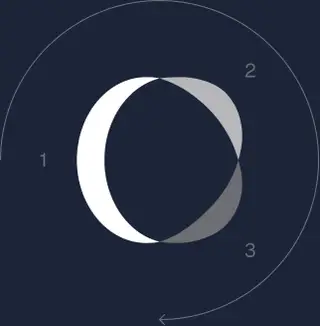
Black & White Logo Options
These are the primary logo appearances for black and white applications.The symbol uses a directional color progression that adapts to background contrast. On a light background, the tones within the symbol run from darker to lighter, clockwise. On a dark background the clockwise direction stays the same, but the progression flips from lighter to darker, preserving clarity and visual balance.
Brand Colors
The refreshed brand is built on a neutral, monochrome palette drawn from the new logo. Color is used sparingly to keep the mark the hero.
Minimum size
Ширина нашего логотипа никогда не должна быть ниже 96 пикселей в цифровом формате и 26 мм в печатном формате.
Цифровой
96 пикселей (ширина)

Печатать
26 мм (ширина)
Рекомендации
A few things to avoid so the logo always shows up at its best.


 Не используйте старый логотип.
 Не используйте только словесный знак.
 Не поворачивайте логотип.
 Не искажайте логотип.
 Не меняйте порядок словесных знаков и значков в обратном порядке.
 Не делайте логотип размытым.
 недостаточным контрастом.
 Не используйте градиенты или тени.
 Не используйте перегруженный фон.

Transform Your Shipment Tracking Today
Discover how TrackingMore can help to further simplify dropshipping and improve customer satisfaction.